| [ Team LiB ] |
|
Using Entry WidgetsThe entry widget supports editing, scrolling, and selections, which make it more complex than label or message widgets. Fortunately, the default settings for an entry widget make it usable right away. You click with the left button to set the insert point and then type in text. Text is selected by dragging out a selection with the left button. The entry can be scrolled horizontally by dragging with the middle mouse button. One common use of an entry widget is to associate a label with it, and a command to execute when <Return> is pressed in the entry. The grid geometry manager is ideal for lining up several entries and their labels. This is implemented in the following example: Example 34-1 Associating entry widgets with variables and commands
foreach {field label} {name Name address1 Address
          address2 {} phone Phone} {
   label .l$field -text $label -anchor w
   entry .e$field -textvariable address($field) -relief sunken
   grid .l$field .e$field -sticky news
   bind .e$field <Return> UpdateAddress
}
Example 34-1 creates four entries that are linked to variables with the textvariable attribute. The variables are elements of the address array. The -relief sunken for the entry widget sets them apart visually. Widget relief is described in more detail on page 614. The Tcl command UpdateAddress is bound to the <Return> keystroke. The UpdateAddress procedure, which is not shown, can get the current values of the entry widgets through the global array address. Validating Entry ContentsAs of Tk 8.3, entry widgets gained several new options that make it easy to prevent users from entering invalid text into an entry. The validate attribute determines when validation should take place. A value of none (the default) disables validation. Other supported values are: focusin (receiving keyboard focus), focusout (losing focus), focus (gaining or losing focus), key (any keypress), and all. For validation to take effect, you must also provide a value for the validateCommand (or -vcmd) attribute. This is a Tcl script to execute whenever validation takes place. If the script returns a Boolean True, the proposed change to the widget is accepted; if the script returns a Boolean False, the proposed change is rejected and the widget's text remains the same. Optionally, you can also assign a Tcl script to the invalidCommand attribute. This script executes if the validation script returns False. The validateCommand validation script can contain "percent substitutions," just like in an event binding. These substitutions occur before executing the script, whenever validation is triggered. Table 34-1 lists the validation substitutions:
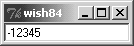
Example 34-2 demonstrates using validation to allow a user to enter only integer values into an entry. Example 34-2 Restricting entry text to integer values
proc ValidInt {val} {
   return [ expr {[string is integer $val]
      || [string match {[-+]} $val]} ]
}

entry .e -validate all -vcmd {ValidInt %P}
pack .e
If an uncaught error occurs during the validation callback, then the validate attribute is set to none, preventing further validation from taking place. Additionally, if the return value of the validation callback is anything other than a Boolean value, validation is also disabled. Therefore, you should take care not to raise errors or return non-Boolean values from your validation callback.
Using textvariables for read-only purposes never causes a problem. However, you can run into trouble if you try to change the value of an entry using its textvariable. If you set the textvariable to a value that wouldn't be accepted by the validation script (that is, it would return False), then Tk allows the change to occur, but disables further validation by setting validate to none. So in general, you should use textvariables only to read an entry's value if you also have validation enabled.
The other caveat to validation is that if you change the value of the widget while evaluating either the validation script or the invalidCommand script, validate is set to none, disabling further validations. The intent is to prevent the change from triggering yet another validation check, which could attempt to change the widget and trigger another validation, and so on in an endless cycle. For most validation applications, this is not a major restriction. In most cases, you simply want to prevent an invalid change from taking place, which you accomplish simply by returning Boolean False from your validation script. But some sophisticated validation schemes might require edits to the widget's text. If you need to change the value of the entry from either the validateCommand or invalidCommand script, the script should also schedule an idle task to reset the validate attribute back to its previous value. Example demonstrates this with a validation command that ensures all letters inserted into an entry are upper case, by converting all characters to upper case as they are inserted. As this example modifies the value of the widget directly, it must reestablish validation in an idle task. Example 34-3 Reestablishing validation using an idle task
proc Upper {w validation action new} {
   if {$action == 1} {
      $w insert insert [string toupper $new]
      after idle [list $w configure -validate $validation]
   }
   return 1
}

entry .e -validate all -vcmd {Upper %W %v %d %S}
pack .e
Tips for Using Entry Widgets$entry xview moveto 1.0 The show attribute is useful for entries that accept passwords or other sensitive information. If show is not empty, it is used as the character to display instead of the real value: $entry config -show * The state attribute determines if the contents of an entry can be modified. Set the state to disabled to prevent modification and set it to normal to allow modification. $entry config -state disabled ;# read-only $entry config -state normal ;# editable Tcl 8.4 added a new state, readonly, in which the contents of the widget can't be edited, just like disabled. However, the readonly state allows the user to select and copy the widget contents. If the widget is a spinbox, the user can also use the up and down spinbuttons to change the value displayed while the widget is in readonly state (but not if it is in the disabled state). The middle mouse button (<Button-2>) is overloaded with two functions. If you click and release the middle button, the selection is inserted at the insert cursor. The location of the middle click does not matter. If you press and hold the middle button, you can scroll the contents of the entry by dragging the mouse to the left or right. |
| [ Team LiB ] |
|
