Generating R plots from Strava data
Motivation
I’ve been running and riding for a while now, but have eased up lately and have no accountability. I wanted a quick and easy way to check my overall progress. I figured R would integrate with Strava’s API and allow me to plot my distance and pace, the two metrics I care about. Although I’ve had to take a rest for the past few months due to illness, the artefects below are informative.
Code is provided below to help you generate your own graphs in a similar style.
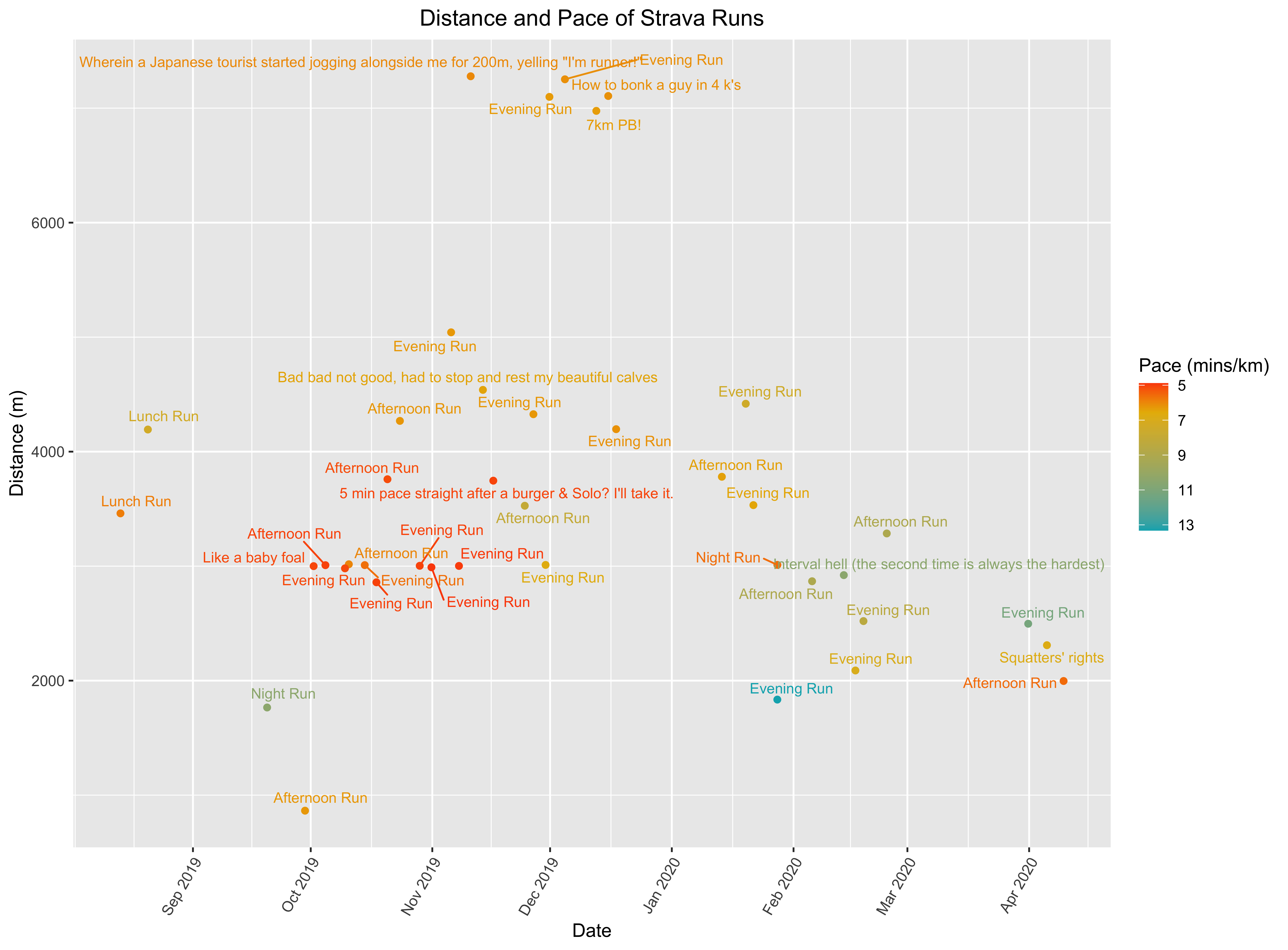
Distance and Pace of Strava Runs
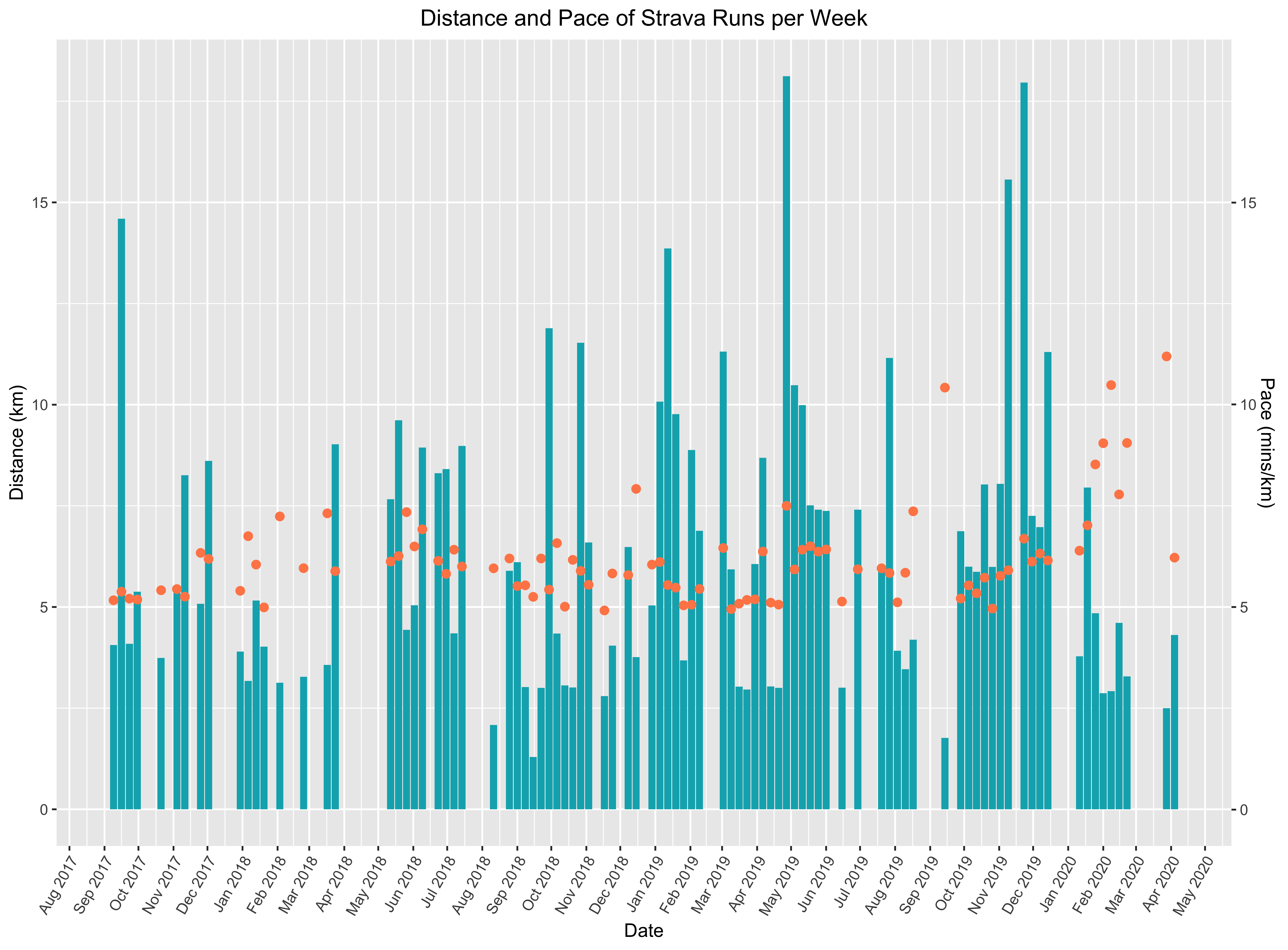
Distance and Pace of Strava Runs
Interactive Chart
The code below can be turned into an interactive plot with the following short code snippet. I have noticed however that ggplotly does not support all of features that might be found in a ggplot; in particular, it was difficult to insert a second y-axis, and the dynamicTicks=TRUE option is required to ensure that the x-axis isn’t converted from dates.
interactive_plot <- plotly::ggplotly(s, tooltip = c("text"), dynamicTicks=TRUE)
The second y-axis
Code
config.yaml
client_id: XXXX
secret: abc123
plot.R
library("yaml")
library("httr")
library("rjson")
library("gtools")
library("ggplot2")
library("anytime")
library("ggrepel")
library("dplyr", warn.conflicts = FALSE)
library("magrittr")
library("lubridate", warn.conflicts = FALSE)

credentials = read_yaml("~/Documents/Blog Research/2020/R-Strava/config.yaml")

app <- oauth_app("strava", credentials$client_id, credentials$secret)
endpoint <- oauth_endpoint(
    request = NULL,
    authorize = "https://www.strava.com/oauth/authorize",
    access = "https://www.strava.com/oauth/token"
)

token <- oauth2.0_token(endpoint, app, as_header = FALSE,
                        scope = "activity:read_all")

activities <- GET("https://www.strava.com/", path = "api/v3/activities",
                  query = list(access_token = token$credentials$access_token, per_page = 200))
activities <- content(activities, "text")
activities <- fromJSON(activities)

activities <- lapply(activities, function(x) {      # Apply an anonymous function on each list elements
  x[sapply(x, is.null)] <- NA           # Replace nulls by "missing" (N/A)
  unlist(x)
})


df <- data.frame(t(sapply(activities[1],c)))
for (i in 2:length(activities)) {
	de <- rbind(data.frame(t(sapply(activities[i],c))))
	df <- smartbind(df, de)
}

non_zero <- df[df$distance != 0,]

non_zero$distance <- as.numeric(as.character(non_zero$distance))
non_zero$start_date_local <- anytime(as.factor(non_zero$start_date_local))
non_zero$elapsed_time <- as.numeric(as.character(non_zero$elapsed_time))

non_zero$pace <- (non_zero$elapsed_time/60)/(non_zero$distance/1000)

runs <- non_zero[non_zero$type == "Run",]

.labs = head(runs$name,40)
p <- ggplot(head(runs,40), aes(x=start_date_local, y=distance)) +
     geom_point(aes(color=pace)) +
     scale_color_gradientn(colors = c("#00AFBB", "#E7B800", "#FC4E07"), values = c(0, 0.8, 1), trans = "reverse") +
     geom_text_repel(aes(label = .labs,  color = pace), size = 3) +
     labs(x = "Date", y = "Distance (m)", title = "Distance and Pace of Strava Runs") +
     scale_x_datetime(date_breaks = "1 month", date_labels =  "%b %Y") +
     theme(axis.text.x=element_text(angle=60, hjust=1)) +
     labs(color="Pace (mins/km)") +
     theme(plot.title = element_text(hjust = 0.5))

run_distance_per_week <-
  runs %>%
  group_by(year_week = floor_date(start_date_local, "1 week")) %>%
  summarize(count = n(),
            distance = sum(distance)/1000,
            time = sum(elapsed_time)/60,
            pace = time/distance)

s <- ggplot() +
    geom_col(run_distance_per_week, mapping = aes(x = year_week, y = distance, text = paste("<b>Week beginning:</b>", year_week, "<br><b>Distance:</b> ", format(round(distance, 2), nsmall = 2), "km")), fill = "#00AFBB") +
    geom_point(run_distance_per_week, mapping = aes(x = year_week, y = pace, text = paste("<b>Week beginning:</b>", year_week, "<br><b>Pace:</b> ", format(round(pace, 2), nsmall = 2), "km/min")), size = 2, color = "#FF8855") +
    scale_y_continuous(name = "Distance (km)",
                       sec.axis = sec_axis(~./1, name = "Pace (mins/km)")) +
    labs(x = "Date", y = "Distance (m)", title = "Distance and Pace of Strava Runs per Week") +
    scale_x_date(date_breaks = "1 month", date_labels =  "%b %Y") +
    theme(axis.text.x=element_text(angle=60, hjust=1)) +
    labs(color="Pace (mins/km)") +
    theme(plot.title = element_text(hjust = 0.5))