| [ Team LiB ] |
|
Padding and AnchorsTable 40-4 lists padding and anchor attributes that are similar in spirit to some packing attributes described in Chapter 25. However, they are distinct from the packing attributes, and this section explains how they work together with the packer. The padding attributes for a widget define space that is never occupied by the display of the widget's contents. For example, if you create a label with the following attributes and pack it into a frame by itself, you will see the text is still centered, despite the anchor attribute. Example 40-3 Padding provided by labels and buttons
label .foo -text Foo -padx 20 -anchor e
pack .foo
The anchor attribute only affects the display if there is extra room for another reason. One way to get extra room is to specify a width attribute that is longer than the text. The following label has right-justified text. You can see the default padX value for labels, which is one pixel: Example 40-4 Anchoring text in a label or button
label .foo -text Foo -width 10 -anchor e
pack .foo
Another way to get extra display space is with the -ipadx and -ipady packing parameters. The example in the next section illustrates this effect. Chapter 25 has several more examples of the packing parameters. Putting It All TogetherExample 40-5 Borders and padding
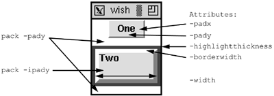
frame .f -bg white
label .f.one -text One -relief raised -bd 2 -padx 3m -pady 2m
pack .f.one -side top
label .f.two -text Two \
   -highlightthickness 4 -highlightcolor red \
   -borderwidth 5 -relief raised \
   -padx 0 -pady 0 \
   -width 10 -anchor nw
pack .f.two -side top -pady 10 -ipady 10 -fill both
focus .f.two
pack .f
The first label uses a raised relief, so you can see the two-pixel border. There is no highlight on a label by default. There is internal padding so that the text is spaced away from the edge of the label. The second label adds a highlight rectangle by specifying a nonzero thickness. Widgets like buttons, entries, listboxes, and text have a highlight rectangle by default. The second label's padding attributes are reduced to zero. The anchor positions the text right next to the border in the upper-left (nw) corner. Note the effect of the padding provided by the packer. There is both external and internal padding in the Y direction. The external padding (from pack -pady) results in unfilled space. The internal packing (pack -ipady) is used by the label for its display. This is different from the label's own -pady attribute, which keeps the text away from the top edge of the widget. |
| [ Team LiB ] |
|

