| [ Team LiB ] |
|
Canvas ObjectsThe next several sections describe the built-in object types for the canvas: arc, bitmap, image, line, oval, polygon, rectangle, text, and window. Each object has its own set of attributes, and some attributes are found on most or all object types. Table 37-1 lists the common item attributes found on all or most objects. All -active and -disabled attributes were added in Tk 8.3, as were the -state attribute, the -offset attribute, and those attributes related to dashes.
Every object has a -tags attribute used to label the object with a list of symbolic names. Most objects, even text objects, specify their color with the -fill attribute; only the bitmap object uses -foreground and -background. If the object has a border, the color of the border is specified with -outline, and the thickness of the outline is specified with -width. Starting in Tk 8.3, lines and objects with borders have a variety of -dash attributes for drawing dashed lines and borders. Canvas Widget and Canvas Object State OptionsTk 8.3 added the -state attribute to the canvas widget and all canvas objects. The canvas state attribute can be set to normal (the default) or disabled, which provides a default state for all objects on the canvas. If an individual canvas object's -state attribute is the empty string (the default), then it inherits the canvas state. However, you can override the "global" canvas state for an individual object by setting its -state attribute to normal, disabled, or hidden. An object in the normal state is visible and any bindings defined for it are fully functional. Additionally, if the mouse is over a normal object, it is activated and any -active* attributes defined for the object take effect. As you would expect, an object in the hidden state is not visible, and its bindings are inactive. An object in the disabled state is visible, but its bindings are inactive and it does not activate when the mouse is over it; additionally, any -disabled* attributes defined for the object take effect. Dashed LinesTk 8.3 introduced the ability to draw lines and object outlines using dashed lines. The primary object attribute for controlling the dash pattern is -dash, although -activedash and -disableddash attributes are available for controlling the dash pattern in different object states. Each of these attributes accepts a dash pattern as a value. One dash pattern format is a list of integers. Each element represents the number of pixels of a line segment. Only the odd segments are drawn using the -outline color. The other segments are drawn transparent. For example the following command draws a line with 6-pixel dashes separated by 2-pixel spaces:
$c create line -dash {6 2}
The other dash pattern format is a string containing any combination of the characters shown in Table 37-2.
For example, the dash pattern {_. ,} is roughly equivalent to {8 4 2 8 4 4} The main difference of the string-based syntax versus the list-based syntax is that it the string-based syntax is shape-conserving. This means that all values in the dash list are multiplied by the line width before display. This assures that "." is always displayed as a dot and "-" as a dash regardless of the line width. Finally, the -dashoffset attribute specifies the starting offset (in pixels) into the pattern provided by -dash.
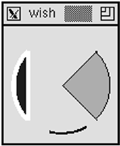
Not all dash patterns are supported on all platforms. On systems that support only a limited set of dash patterns, the dash pattern is displayed as the closest dash pattern that is available. For example, on Windows the dash patterns {.} and {,} and {. } and {, } are displayed identically. Arc ItemsAn arc is a section of an oval. The dimensions of the oval are determined by four coordinates that are its bounding box. The arc is then determined by two angles, the start angle and the extent. The region of the oval can be filled or unfilled, and there are three different ways to define the fill region. The pieslice style connects the arc with the center point of the oval. The chord style connects the two end points of the arc. The arc style just draws the arc itself and there is no fill. Example 37-5 shows three arcs with the same bounding box but different styles and angles: Example 37-5 Canvas arc items
# $c is a canvas
$c create arc 10 10 100 100 -start 45 -extent -90 \
   -style pieslice -fill orange -outline black
$c create arc 10 10 100 100 -start 135 -extent 90 \
   -style chord -fill blue -outline white -width 4
$c create arc 10 10 100 100 -start 255 -extent 45 \
   -style arc -outline black -width 3
An arc object support all of the object attributes listed in Table 37-1. Table 37-3 lists the additional attributes supported by arc objects.
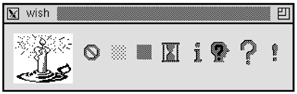
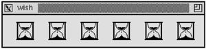
Bitmap ItemsA bitmap is a simple graphic with a foreground and background color. One bit per pixel is used to choose between the foreground and the background. If you do not specify a background color, the background bits are clear and the canvas background shows through. A canvas bitmap item is positioned with two coordinates and an anchor position. Its size is determined by the bitmap data. The bitmap itself is specified with a symbolic name or by the name of a file that contains its definition. If the name begins with an @, it indicates a file name. The bitmaps built into Tk are shown in the example below. Chapter 50 outlines the C interface for registering bitmaps under a name. Example 37-6 Canvas bitmap items
set o [$c create bitmap 10 10 -bitmap @candle.xbm -anchor nw\
   -background white -foreground blue]
set x [lindex [$c bbox $o] 2] ;# Right edge of bitmap
foreach builtin {error gray12 gray50 hourglass \
             info questhead question warning} {
   incr x 20
   set o [$c create bitmap $x 30 -bitmap $builtin -anchor c]
   set x [lindex [$c bbox $o] 2]
}
A bitmap object supports only the -state and -tags attributes listed in Table 37-1. Table 37-4 lists the additional attributes supported by bitmap objects.
Image ItemsThe canvas image objects use the general image mechanism of Tk. You must first define an image using the image command, which is described in Chapter 41 in the section Bitmaps and Images. Once you have defined an image, all you need to specify for the canvas is its position, anchor point, and any tags. The size and color information is set when the image is defined. If an image is redefined, anything displaying that image automatically gets updated. Example 37-7 creates one image and puts six instances of it on a canvas: Example 37-7 Canvas image items
image create bitmap hourglass2 \
   -file hourglass.bitmap -maskfile hourglass.mask \
   -background white -foreground blue
for {set x 20} {$x < 300} {incr x 20} {
   $c create image $x 10 -image hourglass2 -anchor nw
   incr x [image width hourglass2]
}
An image object supports only the -state and -tags attributes listed in Table 37-1. Table 37-5 lists the additional attributes supported by image objects.
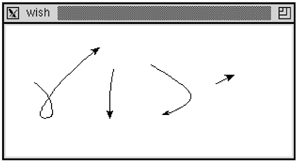
Line ItemsA line has two or more sets of coordinates, where each set of coordinates defines an end point of a line segment. The segments can be joined in several different styles, and the whole line can be drawn with a spline fit as opposed to straight-line segments. The next example draws a line in two steps. In the first pass, single-segment lines are drawn. When the stroke completes, these are replaced with a single line segment that is drawn with a spline curve. Example 37-8 A canvas stroke drawing example
proc StrokeInit {} {
   canvas .c ; pack .c
   bind .c <Button-1> {StrokeBegin %W %x %y}
   bind .c <B1-Motion> {Stroke %W %x %y}
   bind .c <ButtonRelease-1> {StrokeEnd %W %x %y}
}
proc StrokeBegin { w x y } {
   global stroke
   catch {unset stroke}
   set stroke(N) 0
   set stroke(0) [list $x $y]
}
proc Stroke { w x y } {
   global stroke
   set coords $stroke($stroke(N))
   lappend coords $x $y
   incr stroke(N)
   set stroke($stroke(N)) [list $x $y]
   # eval gets the coordinates into individual arguments
   eval {$w create line} $coords {-tag segments}
}
proc StrokeEnd { w x y } {
   global stroke
   set coords {}
   for {set i 0} {$i <= $stroke(N)} {incr i} {
      append coords $stroke($i) " "
   }
   $w delete segments
   eval {$w create line} $coords \
      {-tag line -joinstyle round -smooth true -arrow last}
}
The arrow attribute adds an arrow head to the end of the stroke. If you try this example you will notice that the arrow is not always aimed as you expect. This is because there are often many points generated close together as you release the mouse button. In fact, the X and Y coordinates seen by StrokeEnd are always the same as those seen by the last Stroke call. If you add this duplicate point to the end of the list of points, no arrowhead is drawn at all. In practice you might want to make Stroke filter out points that are too close together. A line object supports all of the attributes listed in Table 37-1 except for -offset, the -outline family of attributes, and the -outlinestipple family of attributes. Remember that the -fill attribute controls the color in which the line is drawn (not the -outline attribute, as is common for other canvas items). Table 37-6 lists the additional attributes supported by line objects. The capstyle affects the way the ends of the line are drawn. The joinstyle affects the way line segments are joined together. The capstyle and joinstyle attributes are from the X window system and may not be implemented on the Macintosh and Windows platforms.
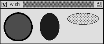
Oval ItemsAn oval is defined by two sets of coordinates that define its bounding box. If the box is square, a circle is drawn. You can set the color of the interior of the oval as well as the outline of the oval. A sampler of ovals is shown in Example 37-9. Example 37-9 Canvas oval items
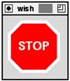
$c create oval 10 10 80 80 -fill red -width 4
$c create oval 100 10 150 80 -fill blue -width 0
$c create oval 170 10 250 40 -fill black -stipple gray12
An oval object support all of the object attributes listed in Table 37-1. There are no additional attributes supported by oval objects. Polygon ItemsA polygon is a closed shape specified by sets of points, one for each vertex of the polygon. The vertices can be connected with smooth or straight lines. Example 37-10 creates a stop sign. The picture is centered at (0, 0) and then moved fully onto the canvas: Example 37-10 Canvas polygon items
$c create poly 20 -40 40 -20 40 20 20 40 -20 40 \
   -40 20 -40 -20 -20 -40 -fill red \
   -outline white -width 5
$c create text 0 0 -text STOP -fill white \
   -font {helvetica 18 bold}
$c move all 50 50
A polygon object support all of the object attributes listed in Table 37-1. Table 37-7 lists the additional attributes supported by polygon objects
Rectangle ItemsA rectangle is specified with two coordinates that are its opposite corners. A rectangle can have a fill color and an outline color. If you do not specify a fill, then the background of the canvas (or other objects) shows through. If you stipple the fill, the background also shows through the clear bits of the stipple pattern. You must use a second rectangle if you want the stippled fill to completely hide what is behind it. Example 37-11 drags out a box as the user drags the mouse. All it requires is remembering the last rectangle drawn so that it can be deleted when the next box is drawn: Example 37-11 Dragging out a box
proc BoxInit {} {
   canvas .c -bg white ; pack .c
   bind .c <Button-1> {BoxBegin %W %x %y}
   bind .c <B1-Motion> {BoxDrag %W %x %y}
}
proc BoxBegin { w x y } {
   global box
   set box($w,anchor) [list $x $y]
   catch {unset box($w,last)}
}
proc BoxDrag { w x y } {
   global box
   catch {$w delete $box($w,last)}
   set box($w,last) [eval {$w create rect} $box($w,anchor) \
      {$x $y -tag box}]
}
The example uses box($w,anchor) to record the start of the box. This is a list with the X and Y coordinates. The eval command is used so that this list can be spliced into the create rect command. Note that as of Tk 8.3 this would not be necessary as the create rect command can now accept a list of coordinates as a single argument. A rectangle object support all of the object attributes listed in Table 37-1. There are no additional attributes supported by rectangle objects. Text ItemsThe canvas text item provides yet another way to display and edit text. It supports selection, editing, and it can extend onto multiple lines. The position of a text item is specified by one set of coordinates and an anchor position. The size of the text is determined by the number of lines and the length of each line. A new line is started if there is a newline in the text string. If a width is specified, in screen units, then any line that is longer than this is wrapped onto multiple lines. The wrap occurs before a space character. The editing and selection operations for text items use indices to specify positions within a given text item. These are very similar to those used in the entry widget. Table 37-8 summarizes the indices for canvas text items.
There are several canvas operations that manipulate text items. These are similar to some of the operations of the entry widget. The dchars and select to operations treat the second index differently than the corresponding operations in the entry and text widget. The character at the second index is included in the operation (e.g., deleted), while in the entry and text widget it is not. The canvas text operations are parameterized by the tag or ID of the canvas object being manipulated. If the tag refers to more than one object, then the operations apply to the first object in the display list that supports an insert cursor. The display list is described on page 581. Table 37-9 summarizes the operations on text items. In the table $t is a text item or tag and $c is a canvas.
There are no default bindings for canvas text items. Example 37-12 sets up some basic bindings for canvas text items. The <Button-1> and <Button-2> bindings are on the canvas as a whole. The rest of the bindings are on items with the text tag. You must add the text tag to text items that should share the editable text behavior. Small procedures are introduced for each binding to hide the details and any local variables needed in the operations. The CanvasFocus procedure uses the canvas find overlapping operation to see if a text object has been clicked. This must be used because find closest finds an object no matter how far away it is. It also uses the type operation to make sure only text objects are given the focus. If you want other object types to respond to key events, you should change that. The CanvasPaste procedure does one of two things. It pastes the selection into the canvas item that has the focus. If no item has the focus, then a new text item is created with the selection as its value: Example 37-12 Simple edit bindings for canvas text items
proc Canvas_EditBind { c } {
   bind $c <Button-1> \
      {CanvasFocus %W [%W canvasx %x] [%W canvasy %y]}
   bind $c <Button-2> \
      {CanvasPaste %W [%W canvasx %x] [%W canvasy %y]}
   bind $c <<Cut>> {CanvasTextCopy %W; CanvasDelete %W}
   bind $c <<Copy>> {CanvasTextCopy %W}
   bind $c <<Paste>> {CanvasPaste %W}
   $c bind text <Button-1> \
      {CanvasTextHit %W [%W canvasx %x] [%W canvasy %y]}
   $c bind text <B1-Motion> \
      {CanvasTextDrag %W [%W canvasx %x] [%W canvasy %y]}
   $c bind text <Delete> {CanvasDelete %W}
   $c bind text <Control-d> {CanvasDelChar %W}
   $c bind text <Control-h> {CanvasBackSpace %W}
   $c bind text <BackSpace> {CanvasBackSpace %W}
   $c bind text <Control-Delete> {CanvasErase %W}
   $c bind text <Return> {CanvasNewline %W}
   $c bind text <Any-Key> {CanvasInsert %W %A}
   $c bind text <Key-Right> {CanvasMoveRight %W}
   $c bind text <Control-f> {CanvasMoveRight %W}
   $c bind text <Key-Left> {CanvasMoveLeft %W}
   $c bind text <Control-b> {CanvasMoveLeft %W}
}
proc CanvasFocus {c x y} {
   focus $c
   set id [$c find overlapping [expr $x-2] [expr $y-2] \
         [expr $x+2] [expr $y+2]]
   if {($id == {}) || ([$c type $id] != "text")} {
      set t [$c create text $x $y -text "" \
         -tags text -anchor nw]
      $c focus $t
      $c select clear
      $c icursor $t 0
   }
}
proc CanvasTextHit {c x y {select 1}} {
   $c focus current
   $c icursor current @$x,$y
   $c select clear
   $c select from current @$x,$y
}
proc CanvasTextDrag {c x y} {
   $c select to current @$x,$y
}
proc CanvasDelete {c} {
   if {[$c select item] != {}} {
      $c dchars [$c select item] sel.first sel.last
   } elseif {[$c focus] != {}} {
      $c dchars [$c focus] insert
   }
}
proc CanvasTextCopy {c} {
   if {[$c select item] != {}} {
      clipboard clear
      set t [$c select item]
      set text [$c itemcget $t -text]
      set start [$c index $t sel.first]
      set end [$c index $t sel.last]
      clipboard append [string range $text $start $end]
   } elseif {[$c focus] != {}} {
      clipboard clear
      set t [$c focus]
      set text [$c itemcget $t -text]
      clipboard append $text
   }
}
proc CanvasDelChar {c} {
   if {[$c focus] != {}} {
      $c dchars [$c focus] insert
   }
}
proc CanvasBackSpace {c} {
   if {[$c select item] != {}} {
      $c dchars [$c select item] sel.first sel.last
   } elseif {[$c focus] != {}} {
      set _t [$c focus]
      $c icursor $_t [expr [$c index $_t insert]-1]
      $c dchars $_t insert
   }
}
proc CanvasErase {c} {
   $c delete [$c focus]
}
proc CanvasNewline {c} {
   $c insert [$c focus] insert \n
}
proc CanvasInsert {c char} {
   $c insert [$c focus] insert $char
}
proc CanvasPaste {c {x {}} {y {}}} {
   if {[catch {selection get} _s] &&
       [catch {selection get -selection CLIPBOARD} _s]} {
      return      ;# No selection
   }
   set id [$c focus]
   if {[string length $id] == 0 } {
      set id [$c find withtag current]
   }
   if {[string length $id] == 0 } {
      # No object under the mouse
      if {[string length $x] == 0} {
         # Keyboard paste
         set x [expr [winfo pointerx $c] - [winfo rootx $c]]
         set y [expr [winfo pointery $c] - [winfo rooty $c]]
      }
      CanvasFocus $c $x $y
   } else {
      $c focus $id
   }
   $c insert [$c focus] insert $_s
}

proc CanvasMoveRight {c} {
   $c icursor [$c focus] [expr [$c index current insert]+1]
}
proc CanvasMoveLeft {c} {
   $c icursor [$c focus] [expr [$c index current insert]-1]
}
Of the attributes listed in Table 37-1, text objects support only the -fill family of attributes, the -stipple family of attributes, and the -state and -tags attributes. Table 37-10 specifies the additional attributes for text items. Note that there are no foreground and background attributes. Instead, the fill color specifies the color for the text. It is possible to stipple the text as well. Additionally, the -width attribute is treated differently than for other canvas objects.
Window ItemsExample 37-13 Using a canvas to scroll a set of widgets
proc Example3713 { top title labels } {
# Create a resizable toplevel window
toplevel $top
wm minsize $top 200 100
wm title $top $title
# Create a frame for buttons,
# Only Dismiss does anything useful
set f [frame $top.buttons -bd 4]
button $f.quit -text Dismiss -command "destroy $top"
button $f.save -text Save
button $f.reset -text Reset
pack $f.quit $f.save $f.reset -side right
pack $f -side top -fill x
# Create a scrolling canvas
frame $top.c
canvas $top.c.canvas -width 10 -height 10 \
-yscrollcommand [list $top.c.yscroll set]
scrollbar $top.c.yscroll -orient vertical \
-command [list $top.c.canvas yview]
pack $top.c.yscroll -side right -fill y
pack $top.c.canvas -side left -fill both -expand true
pack $top.c -side top -fill both -expand true
Scrolled_EntrySet $top.c.canvas $labels
}
proc Scrolled_EntrySet { canvas labels } {
# Create one frame to hold everything
# and position it on the canvas
set f [frame $canvas.f -bd 0]
$canvas create window 0 0 -anchor nw -window $f
# Create and grid the labeled entries
set i 0
foreach label $labels {
label $f.label$i -text $label
entry $f.entry$i
grid $f.label$i $f.entry$i
grid $f.label$i -sticky w
grid $f.entry$i -sticky we
incr i
}
set child $f.entry0
# Wait for the window to become visible and then
# set up the scroll region based on
# the requested size of the frame, and set
# the scroll increment based on the
# requested height of the widgets
tkwait visibility $child
set bbox [grid bbox $f 0 0]
set incr [lindex $bbox 3]
set width [winfo reqwidth $f]
set height [winfo reqheight $f]
$canvas config -scrollregion "0 0 $width $height"
$canvas config -yscrollincrement $incr
set max [llength $labels]
if {$max > 10} {
set max 10
}
set height [expr $incr * $max]
$canvas config -width $width -height $height
}
Example3713 .ex "An example" {
alpha beta gamma delta epsilon zeta eta theta iota kappa
lambda mu nu xi omicron pi rho sigma tau upsilon
phi chi psi omega}
A window object supports only the -state and -tags attributes listed in Table 37-1. Table 37-11 lists the additional attributes supported by window objects. Note that the -width attribute is treated differently than for other canvas objects.
|
| [ Team LiB ] |
|